The Ultimate Guide to a High-Converting Thank You Page
Turn your thank you page into a conversion powerhouse. Learn to design post-purchase experiences that boost sales, build loyalty, and grow your customer base.
2025-12-14
So, what exactly is a thank you page? It’s that little screen your customer lands on right after they’ve done something important—like buying a product, signing up for your newsletter, or filling out a contact form. But calling it just a confirmation page is a massive understatement.
A truly strategic thank you page is one of your most valuable marketing assets. It’s where you can forge a deeper connection with your customer and get them excited for what’s next, all while their engagement is sizzling hot.
Your Thank You Page Is an Untapped Goldmine
Let’s be honest for a second. Most thank you pages are just digital dead ends. They show up, offer a bland "Thanks!", and the customer's journey slams to a screeching halt. That’s a huge missed opportunity.
Think of this page less as the finish line and more as the starting line for their next interaction with you. They’ve just put their trust (and maybe their money) in your hands. Their attention is yours. Don't waste it! This is your golden moment to prove they made a great choice, tell them exactly what to expect, and gently nudge them toward another meaningful action.
Beyond a Simple Confirmation
A brilliant thank you page doesn't just confirm a transaction; it builds momentum. By immediately guiding a fresh lead or a new customer towards another valuable step, you piggyback on that warm, fuzzy feeling they have right after converting.
What could that look like? You could:
- Offer a cheeky, time-sensitive discount on a related product.
- Invite them to join the party over on your social media channels.
- Ask for a referral in exchange for a little something extra.
The potential here is massive. Just look at the Ukrainian e-commerce market for proof of how powerful post-purchase experiences can be. A deep-dive analysis by Promodo in 2024 found that as local online shops dialled in their post-purchase game, their metrics went through the roof. Conversion rates shot up 11% year-over-year, the number of orders skyrocketed by an incredible 47%, and overall site traffic swelled by 32%.
These aren't just vanity numbers; they show a clear link between optimising touchpoints like the thank you page and serious business growth. You can dig into more of the fascinating details in the full Promodo e-commerce report.
Here’s a snapshot of that impressive growth:
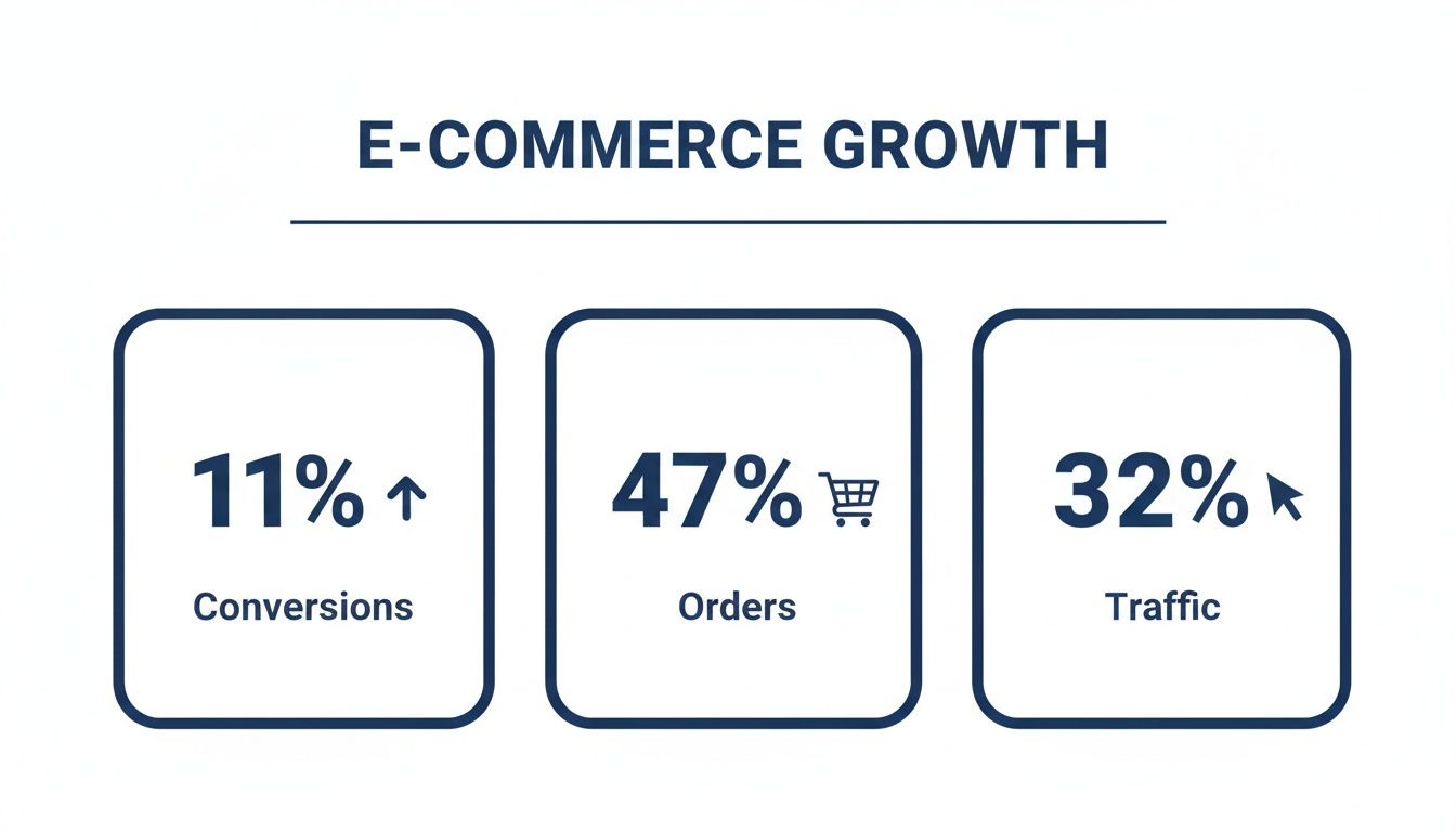
The data speaks for itself. Focusing on the entire customer journey—including what happens after the initial conversion—is directly tied to bringing in more traffic, securing more orders, and boosting your bottom line.
The Core Jobs of a Modern Thank You Page
Here's a breakdown of the essential roles your thank you page must play to evolve from a simple receipt into a powerful marketing tool.
| Core Function | Primary Goal | Example Action |
|---|---|---|
| Confirm & Reassure | Eliminate buyer's remorse and build immediate trust. | "Success! Your order #12345 is confirmed. Look for an email from us shortly." |
| Set Expectations | Clearly explain what happens next to reduce anxiety. | "Your goodies will be shipped within 24 hours. You'll get a tracking link." |
| Deepen the Relationship | Encourage further brand engagement. | "Join our VIP Facebook group for exclusive sneak peeks!" |
| Drive the Next Action | Capitalise on high intent to boost revenue or leads. | "Since you loved X, here's 15% off Y—today only." |
| Gather Insights | Collect valuable customer data or feedback. | "Quick question: How did you hear about us?" |
By making sure your page ticks these boxes, you're not just saying thanks; you're building a smarter, more profitable customer journey.
A thank you page isn't just a polite gesture; it's a strategic pivot. It's where you transform a one-time transaction into a long-term relationship and a fresh revenue stream.
When you start treating this page with the strategic weight it deserves, you unlock a killer tool for keeping customers around and driving immediate repeat business. For more deep dives into boosting user engagement, be sure to explore the guides over on the Notie blog.
Anatomy of a Perfect Thank You Page
Let’s get one thing straight: your thank you page isn’t a digital receipt. It’s not just a polite nod. Think of it as the encore after a great concert—the moment you have your audience's complete, undivided attention. It's where you can turn a one-time transaction into the start of a real relationship.
Every piece of this page has a job to do. When you put them all together, you create an experience that keeps people engaged long after they’ve clicked "buy."
First things first, you have to confirm the action. This is absolutely non-negotiable. Whether someone just bought a product, booked a demo, or grabbed your latest PDF, the page needs to immediately scream, "Success! We got it!"
This simple act of reassurance is huge. It instantly crushes any flicker of buyer's remorse or "did that actually work?" anxiety. A big, bold headline like "Your Order is Confirmed!" or "You're In! Welcome Aboard" does the heavy lifting. Immediately follow that up with specifics—an order number, a quick summary of their purchase, or a note that their message is safely with your team.
Crafting Copy That Connects
Okay, they know it worked. Now, let’s make them feel brilliant for their decision. The words you use here are everything. Your goal is to reinforce the value they’re about to get, framing their action not as a simple purchase, but as a genuinely smart move.
Ditch the dry, robotic stuff. Instead of "Your e-book will arrive shortly," crank up the excitement a bit. Try something like, "Get ready to supercharge your workflow! Your guide is flying to your inbox as we speak." See the difference? That little shift in tone builds anticipation and makes them feel like they just unlocked an achievement.
Managing expectations is also a massive part of this. Tell them exactly what’s coming next.
- For purchases: "Your new gear will be packed and shipped within 24 hours. Keep an eye out for a tracking email from us tomorrow!"
- For sign-ups: "We'll be dropping into your inbox every Tuesday with fresh tips. The first one is already on its way."
- For contact forms: "Our team has received your message and will get back to you within one business day."
Clarity is kindness. It builds trust and shows you respect them.
A great thank you page answers the user's unspoken question—"What now?"—before they even have a chance to ask it. It guides them effortlessly from one positive interaction to the next.
The All-Important Call to Action
Now for the fun part. You have a customer who feels reassured, validated, and maybe even a little excited. This is the perfect moment to gently guide them to the next step. A well-placed call-to-action (CTA) on a thank you page can convert like crazy because you’re catching people at their absolute peak interest.
This isn’t about being a pushy salesperson. It’s about offering something genuinely helpful. Think about what would be most valuable to them right now.
- Offer a complementary product: "Since you loved our productivity planner, check out our matching focus journals—here's 15% off, just for you."
- Invite them to your community: "Join over 5,000 other creators in our exclusive Facebook group to share tips and get feedback."
- Ask for a social share: "Loving your new find? Tell your friends about it! You can use our hashtag #BrandLove to be featured."
By obsessing over these core elements—the confirmation, the copy, and the CTA—you can build a thank you page that does so much more than just say thanks. It reassures, engages, and sets the stage for a long, happy customer relationship.
Taking Your Thank You Page to the Next Level
Alright, you’ve got the basics down. Your thank you page gives a nice, warm confirmation and tells customers what’s next. Solid start. But now it’s time to shift from defence to offence. This is where we turn that polite digital handshake into a serious conversion machine.
What’s the secret? It’s all about tapping into the “buyer’s high.” That golden moment right after someone clicks “buy” is when they’re most excited about and receptive to your brand. Their trust is at its peak, their wallet is already out, and they feel fantastic about their decision. This is your prime opportunity to slide in an offer they simply can't ignore.
Drop in a Time-Sensitive Upsell
The fastest route to bumping up customer lifetime value is a killer upsell or cross-sell. But hold on—not just any old offer will do. To really make it work, it needs to feel exclusive, special, and just a little bit urgent.
A time-sensitive offer is your best friend here. Think "one-time deal" or a countdown timer ticking away a hefty discount. This isn't about being pushy; it's about framing it as a unique chance that’s only available to new customers, right here, right now.
The trick is to offer something that’s a perfect partner to what they just bought.
- Just sold a camera? Offer a lens or memory card at a price they can't get anywhere else.
- They signed up for your fitness app? Hit them with a one-time deal on a personalised nutrition plan.
- They purchased your software? How about an exclusive template pack for just a few extra pounds?
When you nail the relevance, it feels less like a sales pitch and more like a genuinely helpful suggestion. You're showing them you get it, and you're offering the logical next step on their journey with you.
Ask for Referrals and Social Shares
Let's be honest, your happiest customers are your most powerful marketing tool. So, while they’re still basking in the glow of their great decision, why not give them a gentle nudge to spread the word? The key is making it dead simple and worthwhile.
Ditch the generic "Follow us on social media" plea. Get specific. Give them social sharing buttons that pre-populate a message for them. Even better, set up a simple referral programme that benefits everyone.
Pro Tip: Don't make it about you. Frame the share as a way for their friends to get a great deal. For example: "Love your new planner? Give your friends 15% off their first order and get £10 for each friend who buys!"
This little switch in framing turns a self-serving request into a win-win, making people far more likely to actually do it.
Snag Crucial Feedback with a Micro-Survey
What if you could peek inside your customer's head right after they made a purchase? You can get surprisingly close with a quick micro-survey on your thank you page. I’m not talking about a 20-question behemoth. Just one or two simple, direct questions will do.
- "What was the #1 reason you chose us today?"
- "How did you first hear about our brand?"
- "If you could wave a magic wand, what’s one thing we could do to improve your shopping experience?"
These little nuggets of feedback are pure gold. They give you a direct line into your customers' motivations and the real-world effectiveness of your marketing. You can even use this to segment your audience for future campaigns. Our guide on building a powerful quiz maker has even more ideas for structuring questions to pull out valuable data.
Don’t underestimate the power of volume here. As impressive Ukrposhta campaign results from Ukrainian digital marketing show, massive media buys can crank up landing page conversions by 4x to 124x. When you’re converting that many more people, the thank you page suddenly becomes an incredibly valuable piece of real estate for capturing extra revenue and insights from a much, much larger audience.
Getting Technical: Tracking, Redirects, and Personalisation
A killer thank you page isn’t just about clever copy and a nice design; the real magic happens behind the scenes. Getting the technical bits right is what turns a simple confirmation into a powerhouse for business intelligence and, ultimately, more revenue. It all begins with a smooth, invisible handoff for your new customer or lead.
First thing's first: you need an automatic redirect. The moment someone hits "submit" or "buy now," they should be whisked away to your thank you page. No extra clicks, no waiting. This seamless transition provides immediate reassurance that their action was successful, eliminating that brief moment of anxiety we all feel online.
Where to Put Your Tracking Pixels
Now for the really juicy part—installing your tracking pixels. Let me be clear: your thank you page is the single most valuable spot on your entire website to measure a conversion. Why? Because only people who have actually completed the desired action ever land there. It’s the finish line.
When you place your Meta Pixel or Google Analytics tag here, you're firing a conversion event with absolute certainty. This isn't just data; it's pure gold.
- Nail Your Attribution: You can finally see, without a doubt, which ad, email, or social post actually drove that sale. The guessing game is over.
- Smarter Retargeting: Build audiences of actual paying customers. This lets you exclude them from future ads for the thing they just bought and instead target them with relevant upsells.
- Better Lookalike Audiences: Want to find more people like your best customers? Create lookalike audiences based on a list of people who have already proven they’ll spend money with you.
This simple setup cleans up your marketing data overnight. You stop wasting budget advertising to people who have already converted and start making much sharper decisions.
Forget tracking button clicks on a form. The only conversion that truly counts is the one that happens after the payment goes through, and your thank you page is the undisputed proof.
Using Data to Get Personal
Once your tracking is locked in, you can start having some real fun with personalisation. The information your customer just gave you—what they bought, which form they filled out—is your key to making the thank you page feel like it was made just for them.
You can do this by passing data through URL parameters or using cookies to dynamically change what appears on the page. For example, if someone just bought a brand-new camera, your thank you page shouldn't show them a random product. Instead, it can automatically display a special offer on a camera bag or a memory card.
If you’re looking for an easier way to capture and pass this info, a good form builder can automate a lot of this heavy lifting. This kind of targeted recommendation feels less like a pushy sales tactic and more like a genuinely helpful suggestion, which dramatically boosts your chances of scoring that immediate second conversion.
How to Test and Tweak Your Thank You Page for Maximum Impact
Right, so you’ve launched your thank you page. Job done? Not even close. Getting it live is just stepping into the ring; the real match begins now. If you want to squeeze every last drop of value out of this page, you’ve got to get comfortable with constant tinkering. This is how you separate the decent pages from the ones that become serious money-makers.
The goal here isn't just a vague "make it look better." You need to be methodical. What's the one thing you want this page to achieve? More upsell conversions? A flood of new social media followers? A bigger email list? Pinpoint that primary goal first, because it’s going to steer every single test you run.
High-Impact Elements to A/B Test
Look, not all tests are born equal. If you want to see results without waiting for months, you need to focus on the big levers—the changes that are most likely to make someone act. Don't start by testing 50 shades of grey for your footer text; start with the big stuff.
Here are a few juicy areas to get your A/B testing journey started:
- The Main Offer: This is a classic battle. Pit a straight discount against a freebie. For example, is "15% off your next order" more compelling than "Get a free starter kit with your next purchase"? Only a test will tell you for sure.
- The Headline: Your headline is the first thing people read, so it has to land. Try a simple, direct confirmation like "Thanks! Your Order Is Confirmed" against something that builds a bit more excitement, like "You've Made a Great Choice! Here's What's Next..."
- Call-to-Action (CTA) Copy: The words on your button can make or break a conversion. It’s amazing what a difference a few words can make. A simple test could compare a high-commitment phrase like "Buy Now" with something that feels a bit softer, like "Add to My Order" or "Claim My Discount."
- A Bit of Urgency: Does a little fire underneath them get people moving? Test it! Compare a standard, evergreen offer against one with a ticking countdown timer or some punchy copy like "This offer expires when you leave the page!"
Stop guessing what your customers want. A proper A/B testing plan gives you cold, hard data, letting you make decisions that actually affect your bottom line. It pulls emotion and guesswork right out of the equation.
Measuring Success and Crowning a Winner
Once a test is live, you need to know how to keep score. Your main goal obviously dictates your most important metric, but don't get tunnel vision. You need to keep an eye on the side-effects, too.
Let's say you're testing a new upsell offer. Your primary metric is, of course, the upsell conversion rate. But you should also be watching what happens to your social shares and newsletter sign-ups. You don't want to hit one target only to find you've accidentally torpedoed another.
It helps to have a yardstick. Benchmarks from Ukrainian digital marketing agencies show that average landing page conversion rates hover around 5.9%, with anything over 10% being a fantastic result. This tells us that even tiny wins on your thank you page can have a huge knock-on effect. In fact, some Ukrainian e-commerce agencies have boosted conversions by a staggering 55% just by optimising the user experience on pages like this. That’s serious proof that paying attention here pays off. For a deeper dive into these numbers, you can explore the data on landing page performance.
The secret is to treat it like a science experiment. Start with a clear hypothesis ("I believe changing the CTA button colour from blue to orange will increase clicks by 10%"). Let the test run until you have enough data to be confident in the result, declare a winner, roll out the change, and move on to the next test. It’s this constant cycle of testing and learning that leads to unstoppable growth.
Tackling Your Burning Thank You Page Questions
Alright, you've got the grand vision for your thank you page, but a few nagging practical questions are probably rattling around in your head. It happens to everyone. Let's clear the air and answer some of the most common queries I hear from clients and colleagues.
What’s the One Thing I Absolutely Cannot Mess Up?
If you only get one thing right, make it this: crystal-clear, immediate confirmation. Before you even think about upselling, cross-selling, or asking for a follow on Instagram, you must put the user's mind at ease.
They just handed over their money or personal information. Their biggest fear right now is, "Did it work?" A simple, bold "Your order is confirmed!" or "Success! You're on the list" is non-negotiable. This isn't just a nicety; it’s the foundation of trust. Get that wrong, and any other brilliant marketing tactic on the page is dead in the water.
The primary job of your thank you page is to eliminate post-conversion anxiety. Reassurance first, marketing second.
How Do I Actually Build a Custom Thank You Page?
This is where the rubber meets the road, and the "how" really depends on the tools you're using.
- On Shopify: This can be a bit tricky, as Shopify likes to keep its checkout process locked down. You can sometimes make minor edits by digging into your theme's code or, more commonly, by using a specialised post-purchase app. These apps essentially hijack the standard page and let you build a much richer experience.
- On WordPress (with WooCommerce): You have a lot more freedom here. The process is wonderfully straightforward: just build a new page with your favourite editor (like Elementor or the block editor). Then, pop into your WooCommerce settings, find the right field, and tell it to use your shiny new page as the official thank you page. Done. Customers will automatically land there after a purchase.
The WordPress route definitely gives you more creative control to build something truly unique without fighting the platform.
Should Every Single Product Get a Unique Offer?
In a perfect world with unlimited time? Absolutely. The more tailored the offer, the more likely someone is to take it. Think about it: if someone just bought a high-end camera, offering them a discounted lens or a memory card on the thank you page is a no-brainer. It's an easy win.
But let's be realistic—creating a custom thank you page for hundreds of individual products is a logistical nightmare. A much smarter approach is to start with your main product categories. Group similar items together and create a tailored thank you page offer for each group. This way, you get most of the benefits of personalisation without drowning in an endless to-do list. It’s the perfect middle ground between relevance and sanity.
Ready to build your own forms and thank you pages in minutes? With Notie, you can turn simple notes into powerful, interactive forms and documents with AI assistance. Collect unlimited responses and manage everything from a single, organised workspace. Get started with Notie for free.